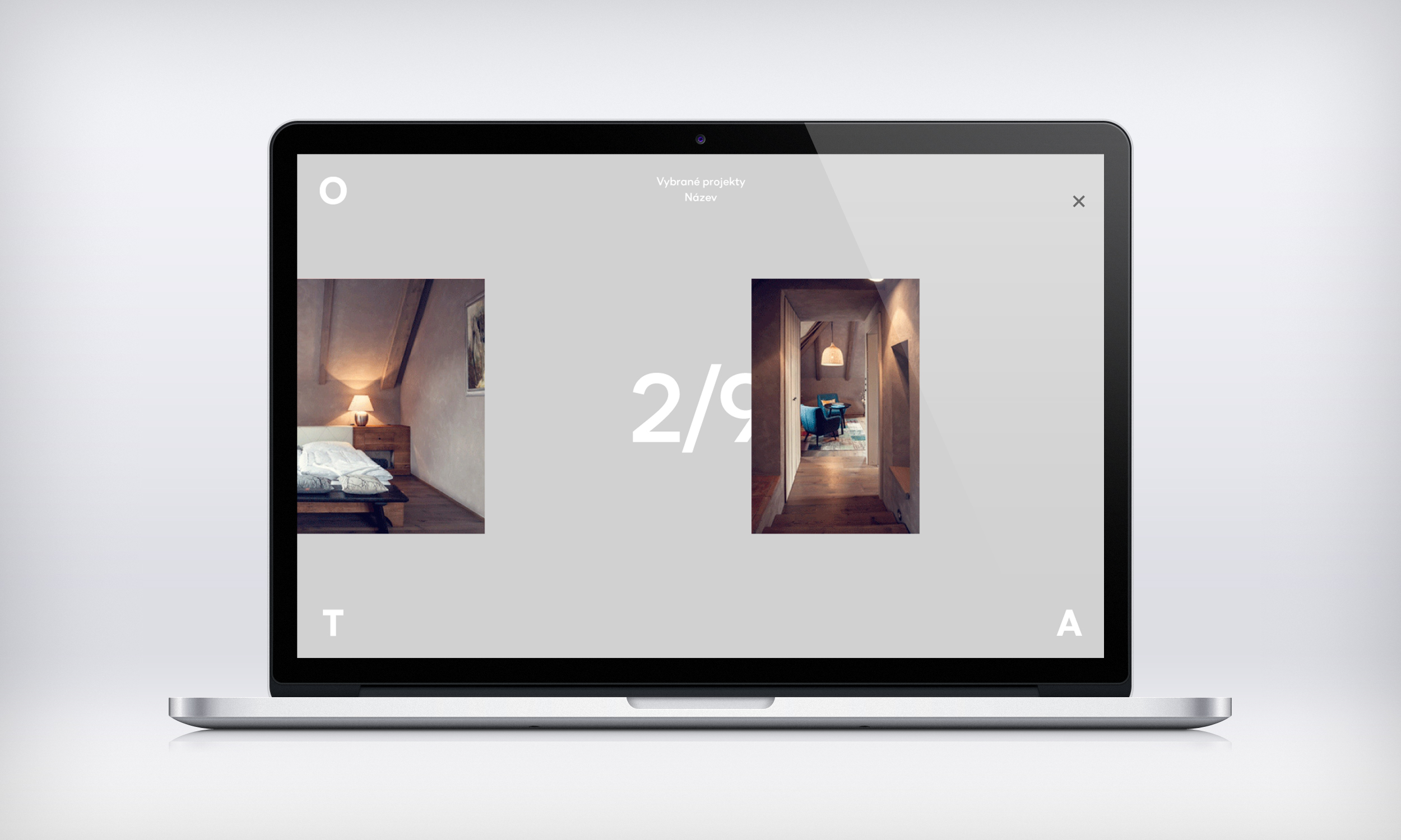
O. T. A. Studio
Visual identity ǀ architeture studio visual identity, web design and layout of graphic outputs
We met Ondřej and Tomáš when we worked at the EKO-KOM Exhibition “Od věku sloužím člověku” on wrapping and packaging. Ondřej and Tomáš created the architectural design, we did the graphic design. Later, we agreed to work together on the logo redesign and new visual style for their O.T.A. Studio.
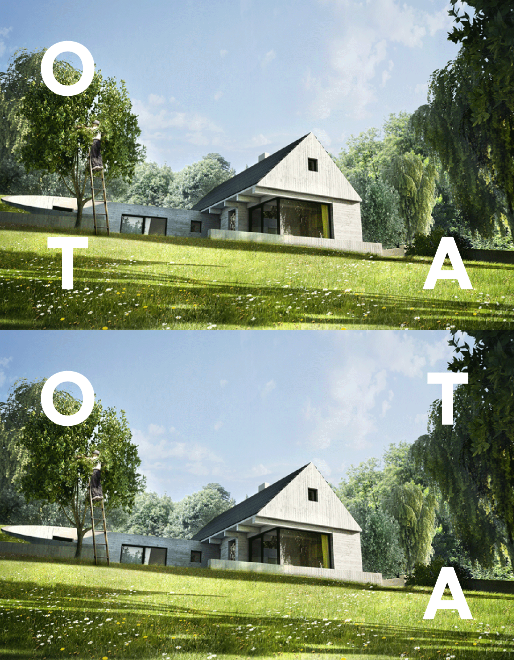
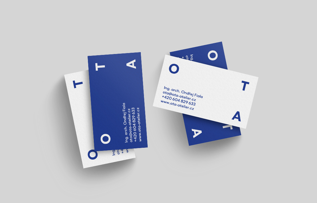
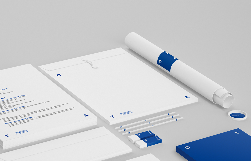
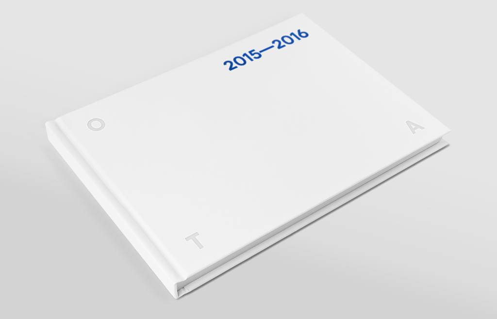
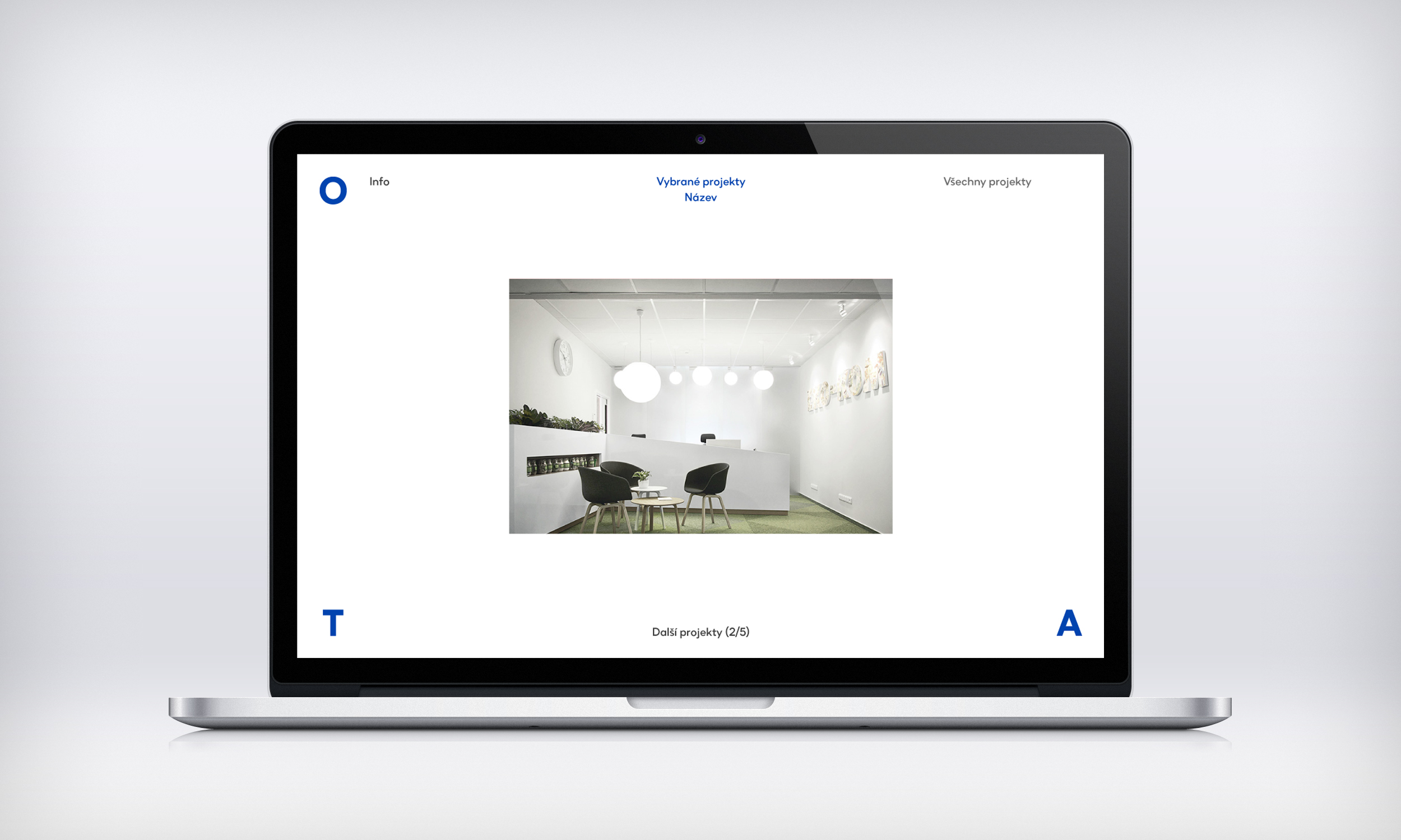
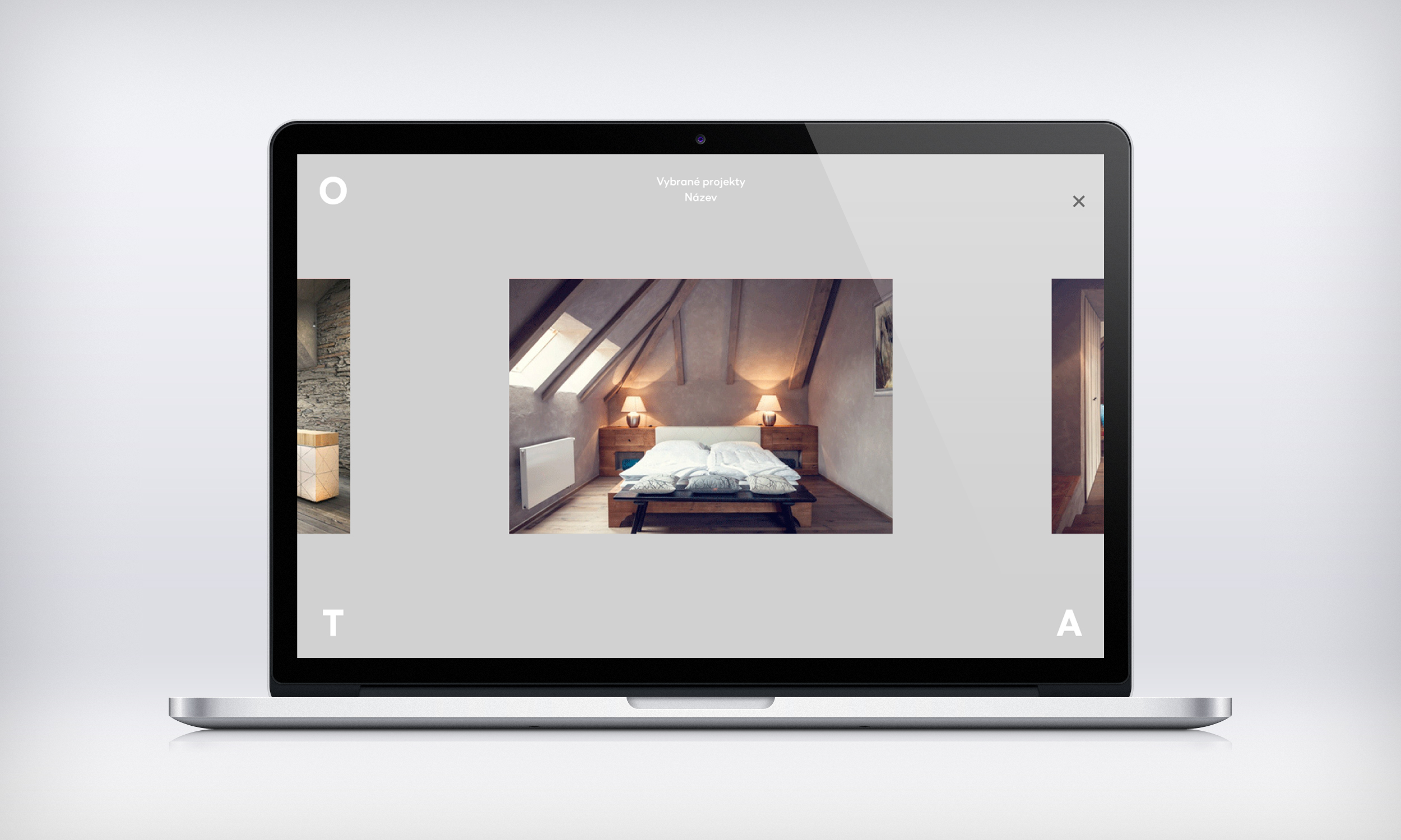
The dynamic logo reflects O.T.A.’s approach and the diversity of their ideas. Depending on the format, the letters of the studio’s name shift to the corners, opening new dimensions within the space. We finished the overall look with a striking blue area, complemented by images of their architectural and object designs.
Realized 2015
