Museum of Czech Literature
Visual identity ǀ logo and visual style redesign, building orientation system, printed matters graphic layout, merchandise, souvenirs
Museum of Czech Literature (MCL) manages and presents to the public important collections of Czech literature and book culture from the 18th century to the present. In 2020, one of the MCLs buildings was reconstructed – Petsch’s Villa, which will serve as a Museum of Literature with new permanent exhibitions. On the occasion of the opening of these premises, the institution announced a competition for the complete visual identity of MCL. Since we have previously designed a website for them, we decided to participate in the competition.
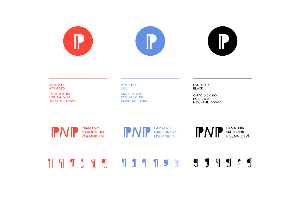
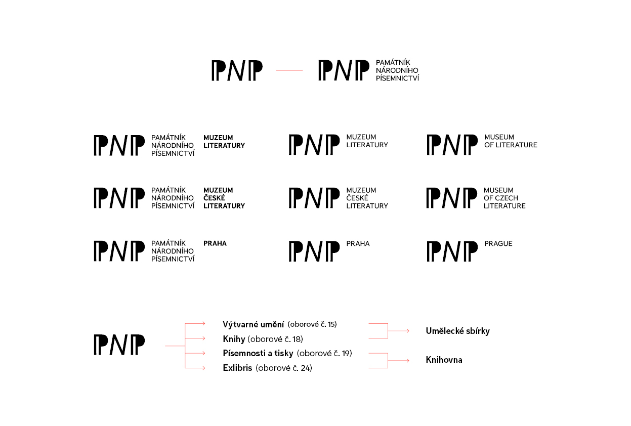
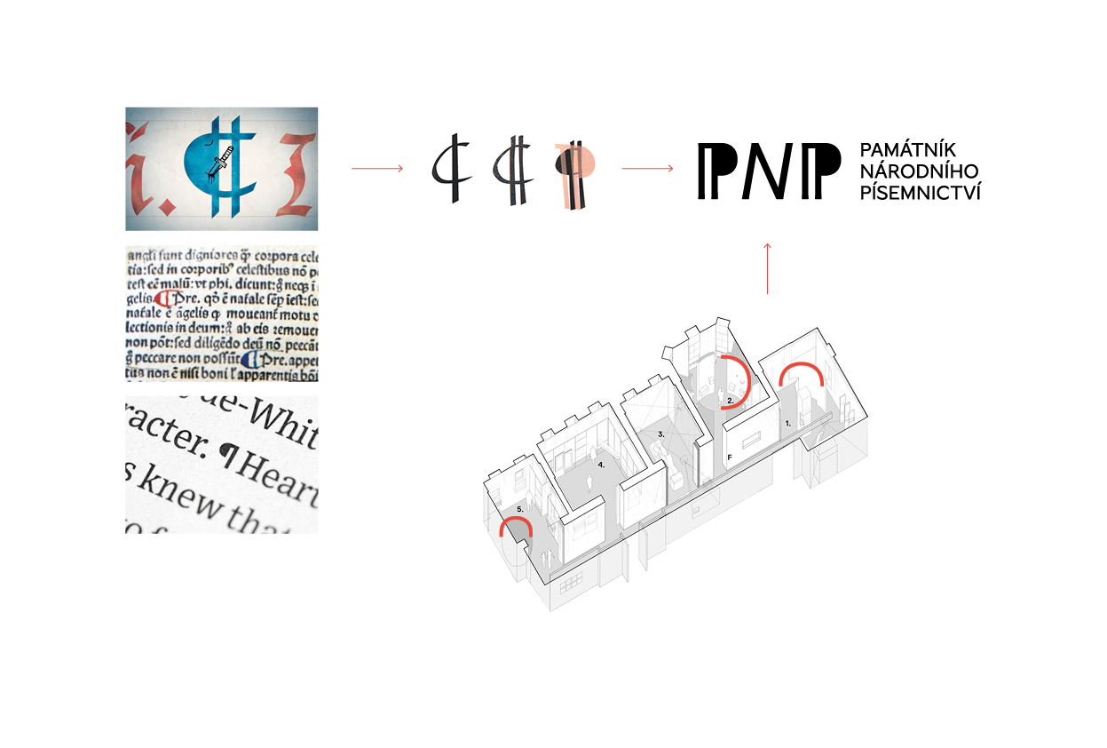
It was most important for us to create the visual identity featuring the characteristics of the MCL institution. Beginning with the logo, we wanted to incorporate layers of meaning through a mark that reflects a simple and iconic initials “P” where its rounded curves correspond with the curvy elements of the Petsch’s Villa architecture.
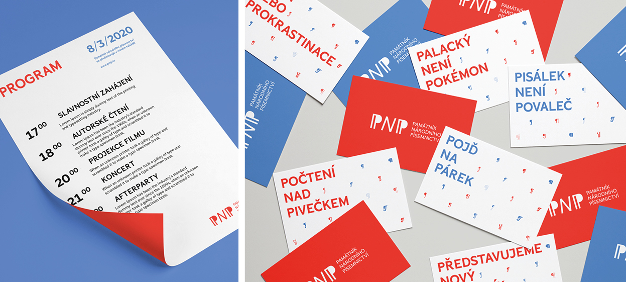
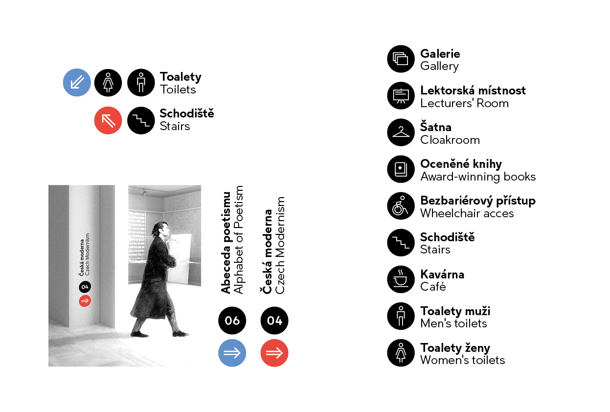
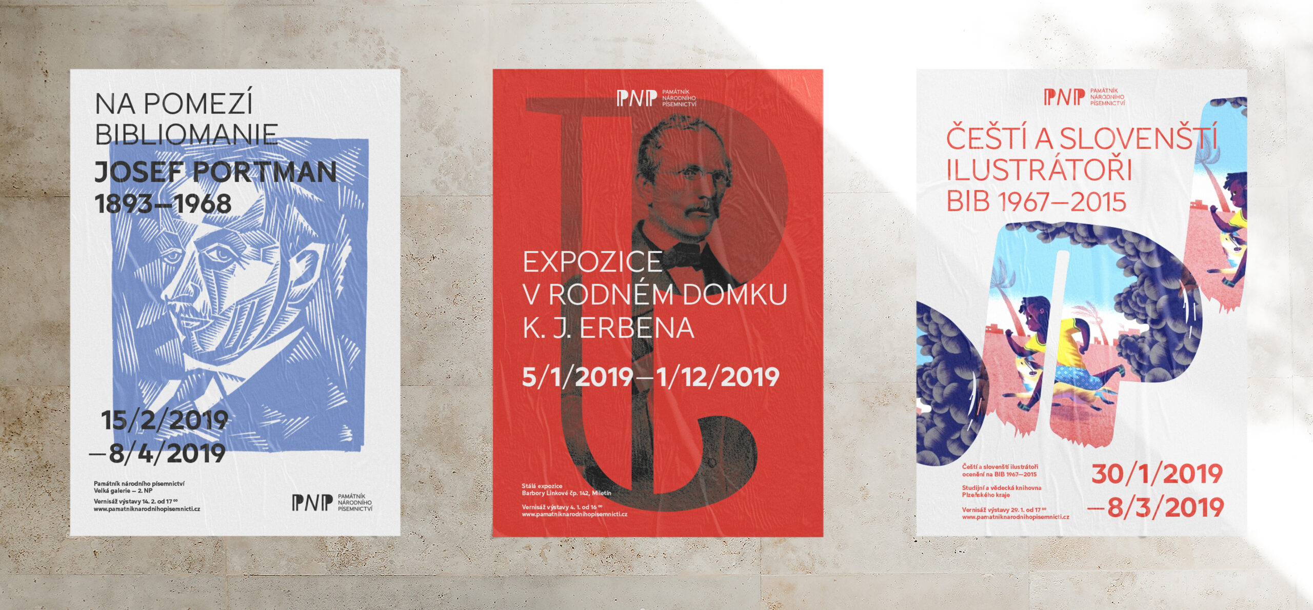
The logomark “P” inspired by pilcrow serves as the touchstone for the brand’s visual identity with its long history, where it was used to indicate paragraphs within a continuous stream of text. The detail refinements in the serif choice of the typography gives the text unexpected temperament. Red, blue and black color palette paired with minimalist typography emphasize both the national identity and makes it more appealing to the future young generation. It’s the sign of confidence and majestic proportion of the MCL. The colors also correspond with the two floor level orientation system with the charming and fresh signpost and pictograms, we crafted.
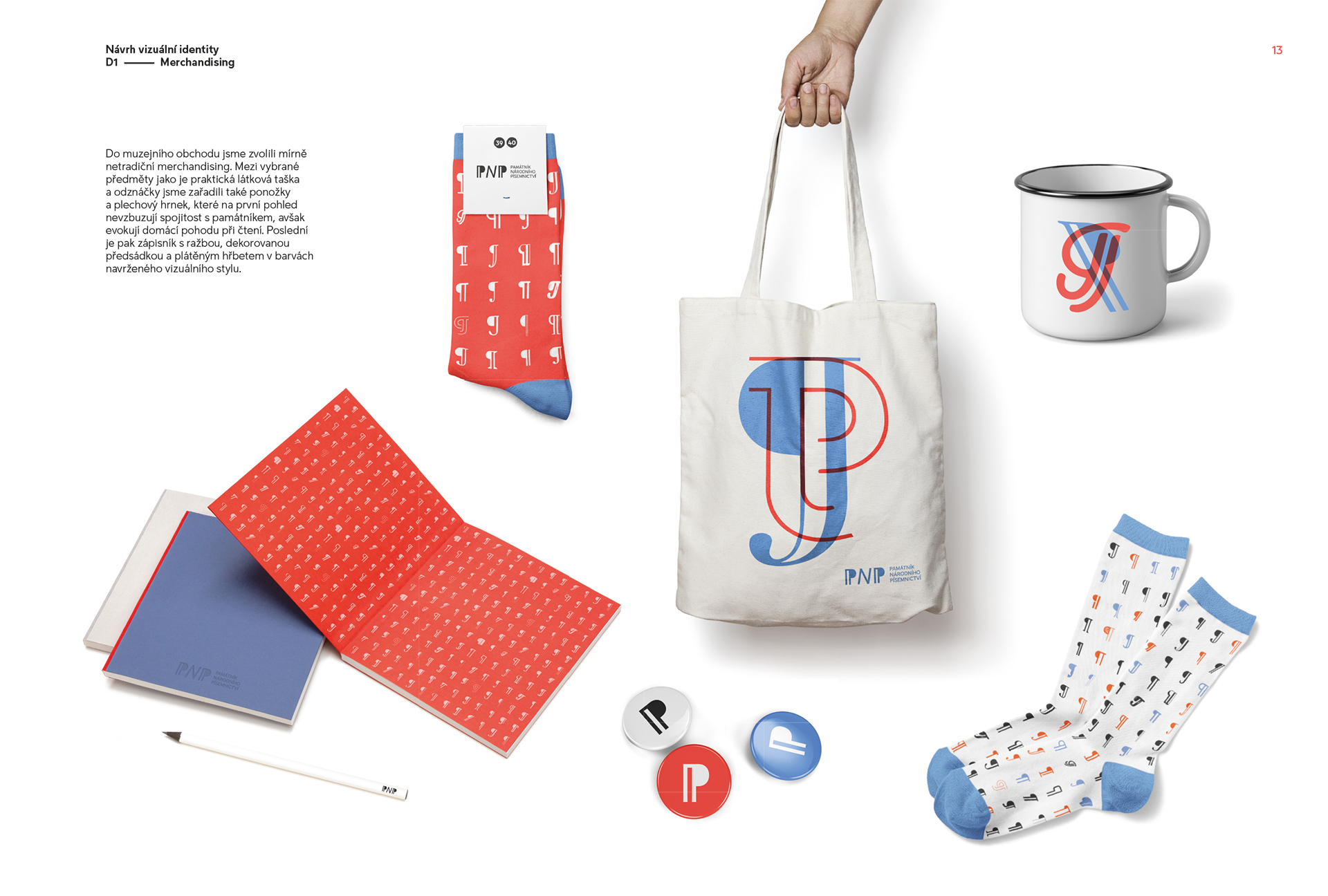
Also we presented slightly different merchandise, including beautiful fabric bags, badges, socks and mugs that do not necessarily evoke the connection with the MCL, rather it brings a home comfort while reading. Last but not least, it’s a canvas style embossed notebook.
Design 2019
