
Prodesi / Domesi
Graphic design ǀ exhibition exposition
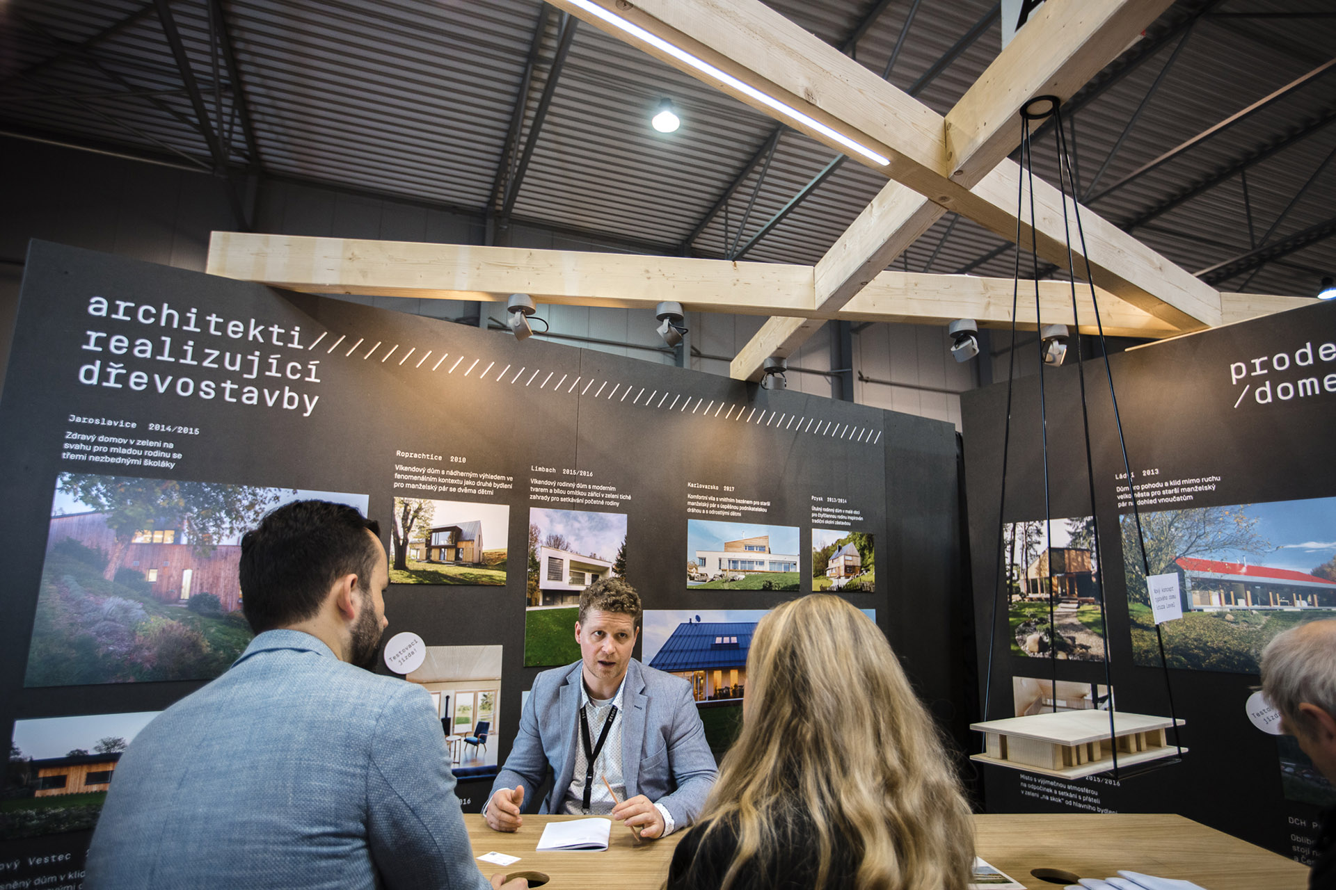
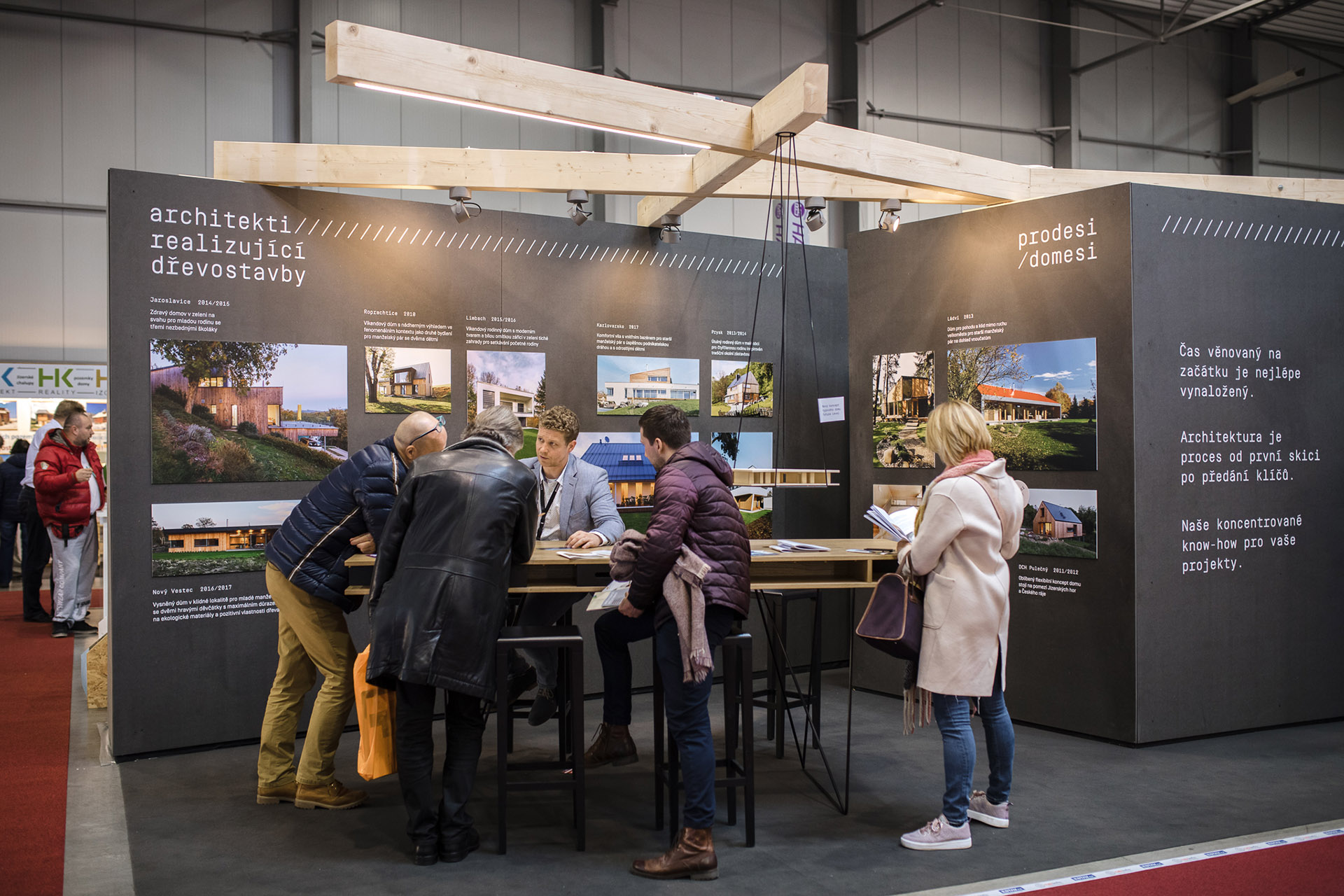
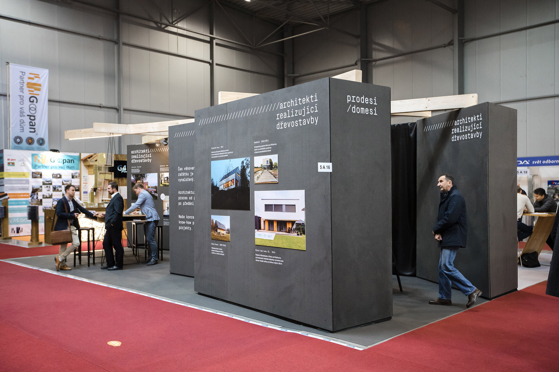
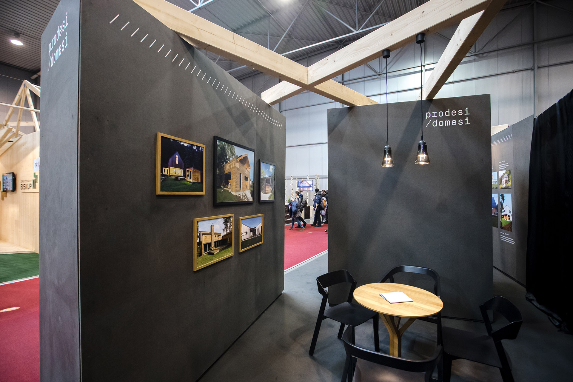
As part of our long-term cooperation, including graphic work, printing and production, we also create a solution for Prodesi / Domesi exhibition at the trade fair for wooden buildings. The architects from Prodesi / Domesi studio realize wooden buildings and they are leaders in their field, which is evidenced by number of awards they have received.
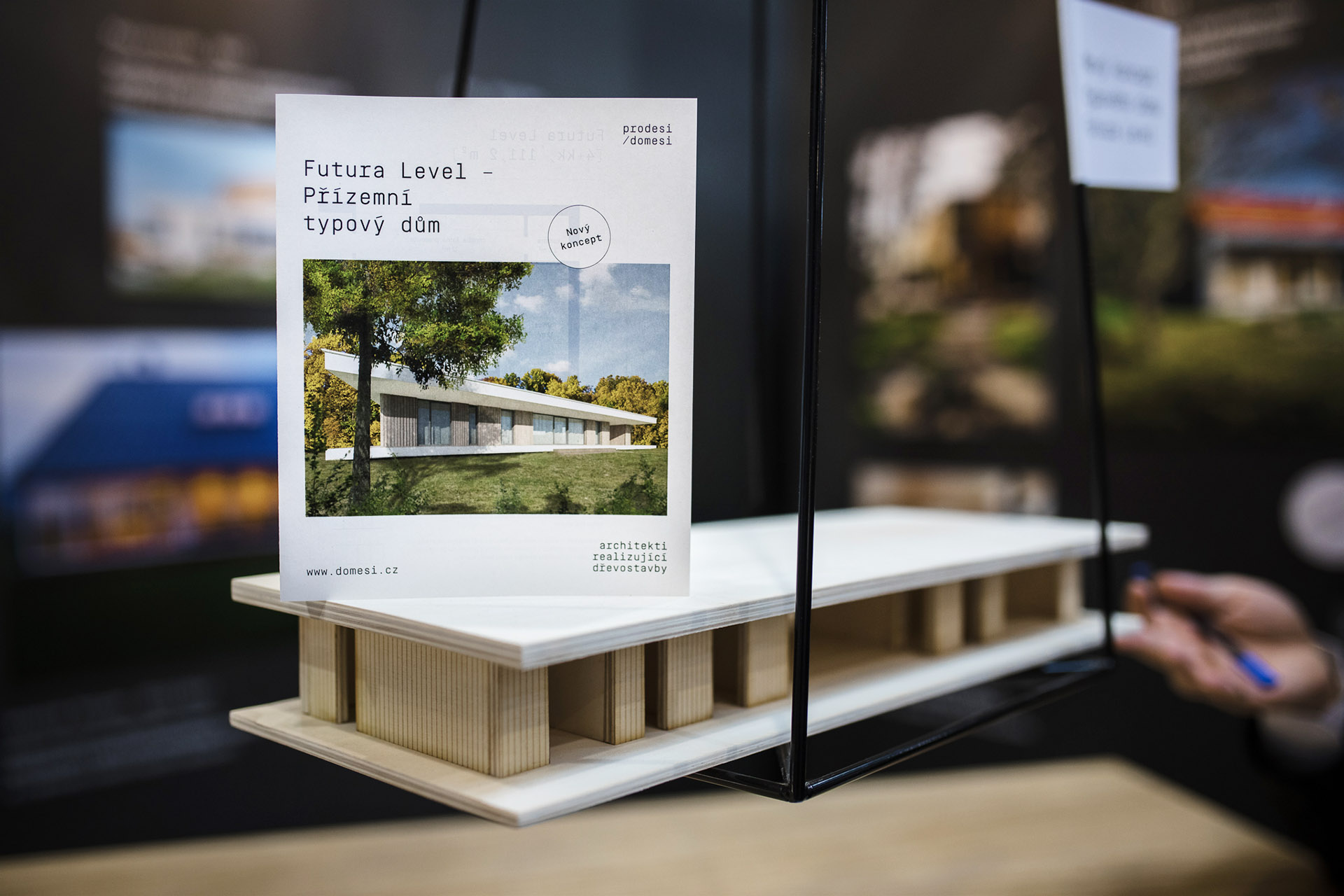
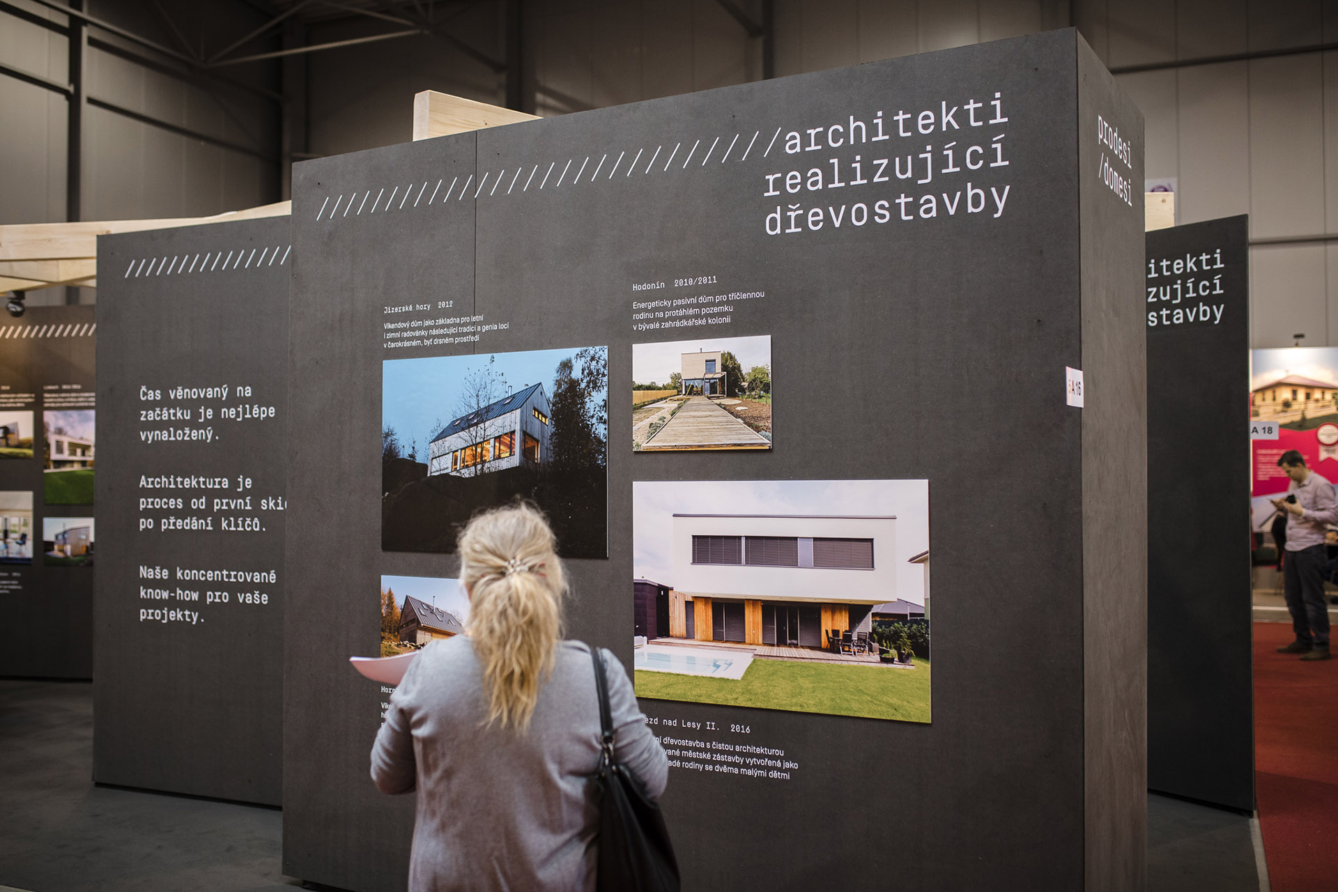
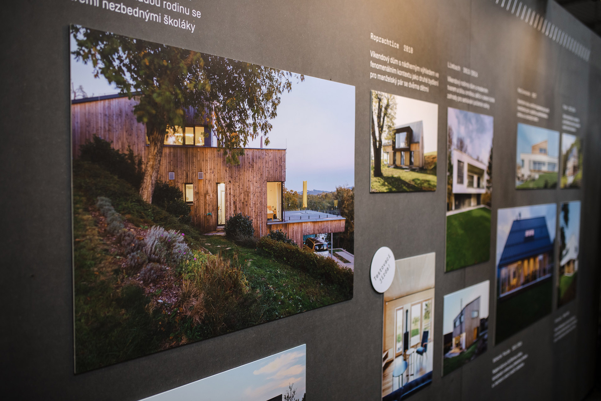
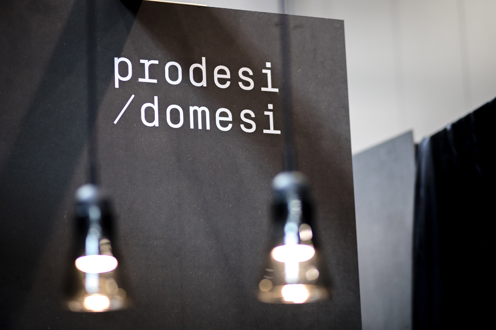
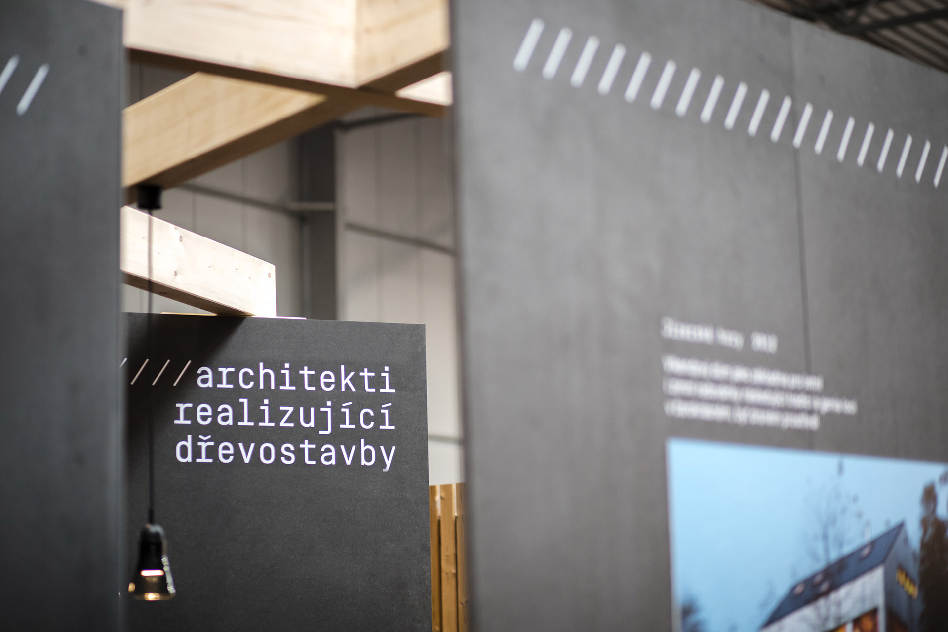
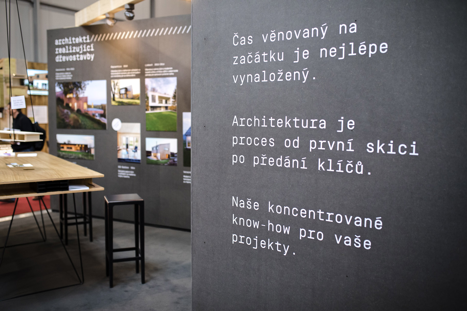
When designing the exhibition, we always adhere to the complex visual conception, which we have created for architects. The symbol of the Prodesi / Domesi is a typographic slash symbolized the unification of two previous studios. Beside the technical typography Simpolon from swiss typographs, the elementary feature of visual identity is the slash. The basis is a minimalistic black-and-white colour scheme and precise work with font, supplemented by photographs of completed buildings. Text and pictures are intentionally composed to eye level so that they are comfortably visible clients and at the same time they are not covered by the exposition itinerary.
Realized 2019-2020
