Twentysix
Graphic design ǀ logo re-design, visual style, packaging system, production of printed materials and notebooks
Minimalism puts emphasis on precise details. Simple is honest. Nothing can hide behind it. This is exactly what Twentysix’s jewellery, leather bags, and felt iPad covers areabout, and it’s the basis behind our vision for the brand.
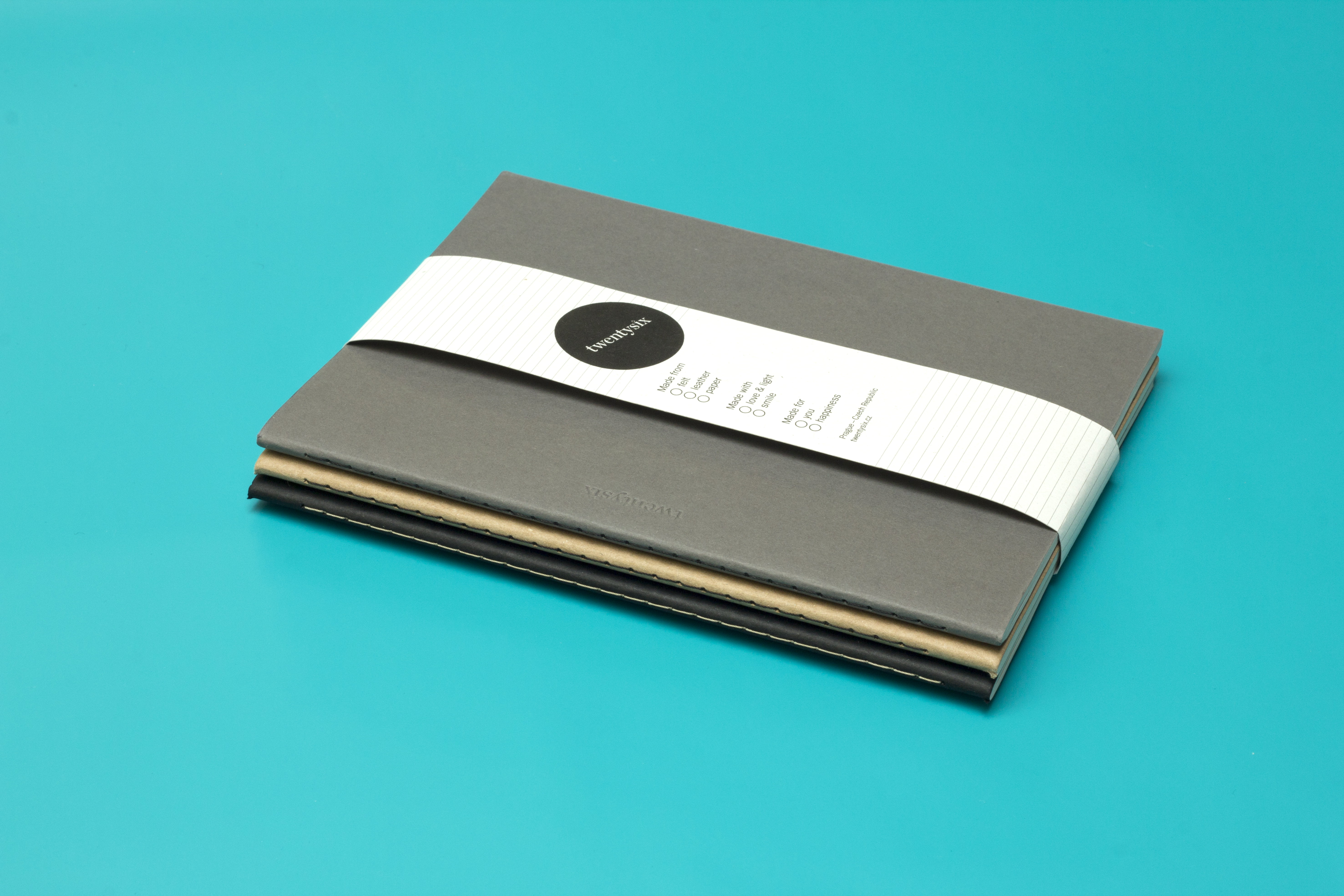
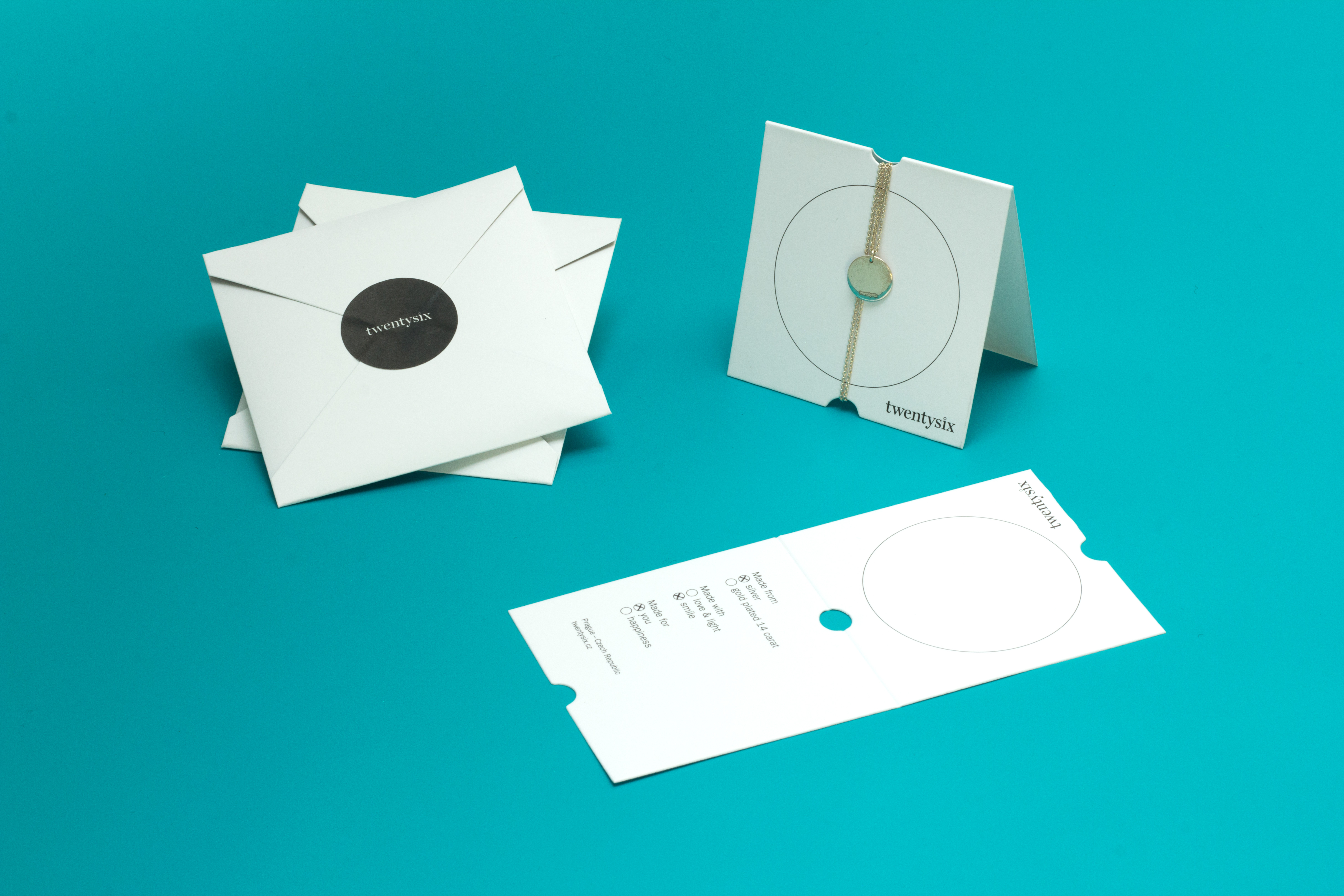
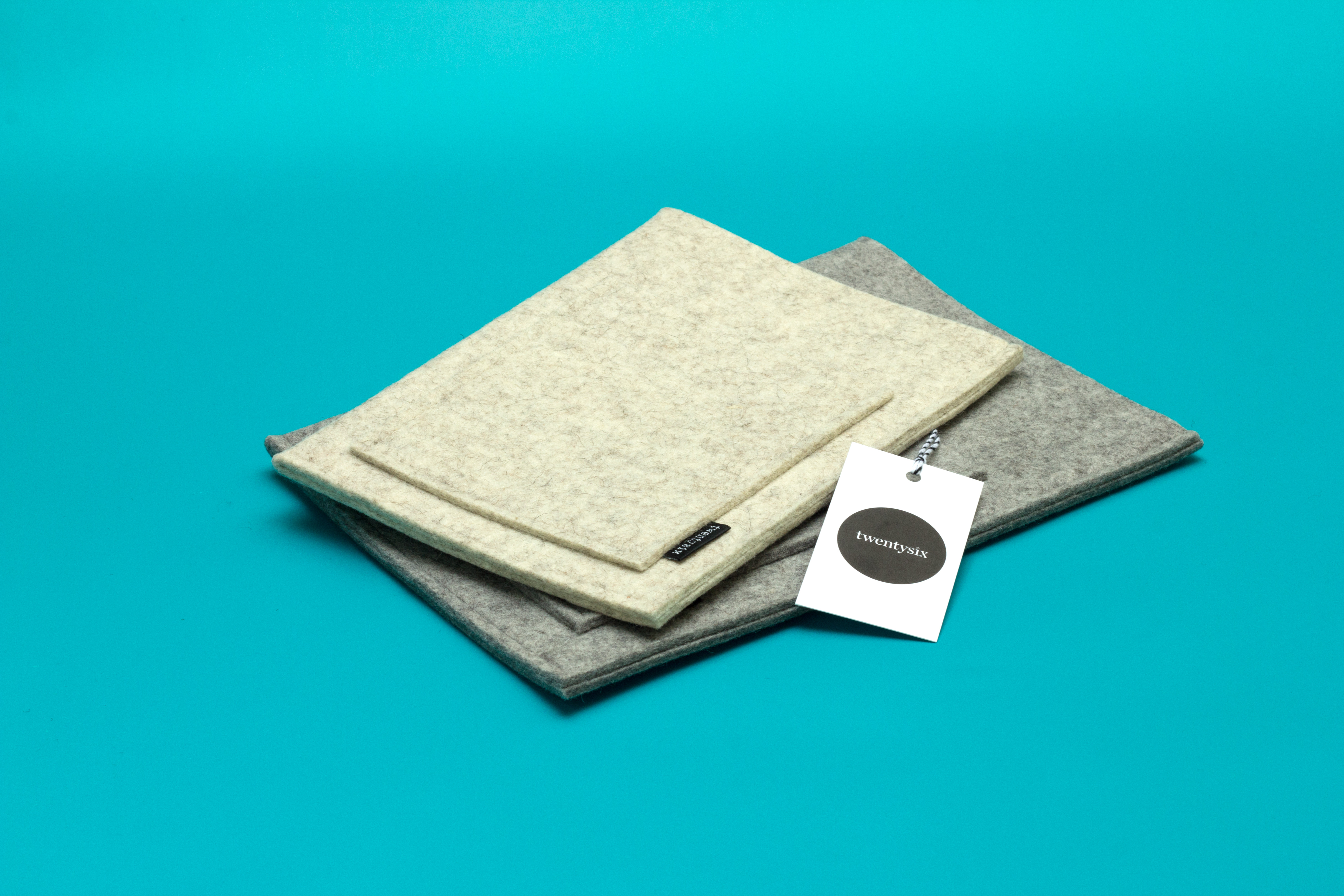
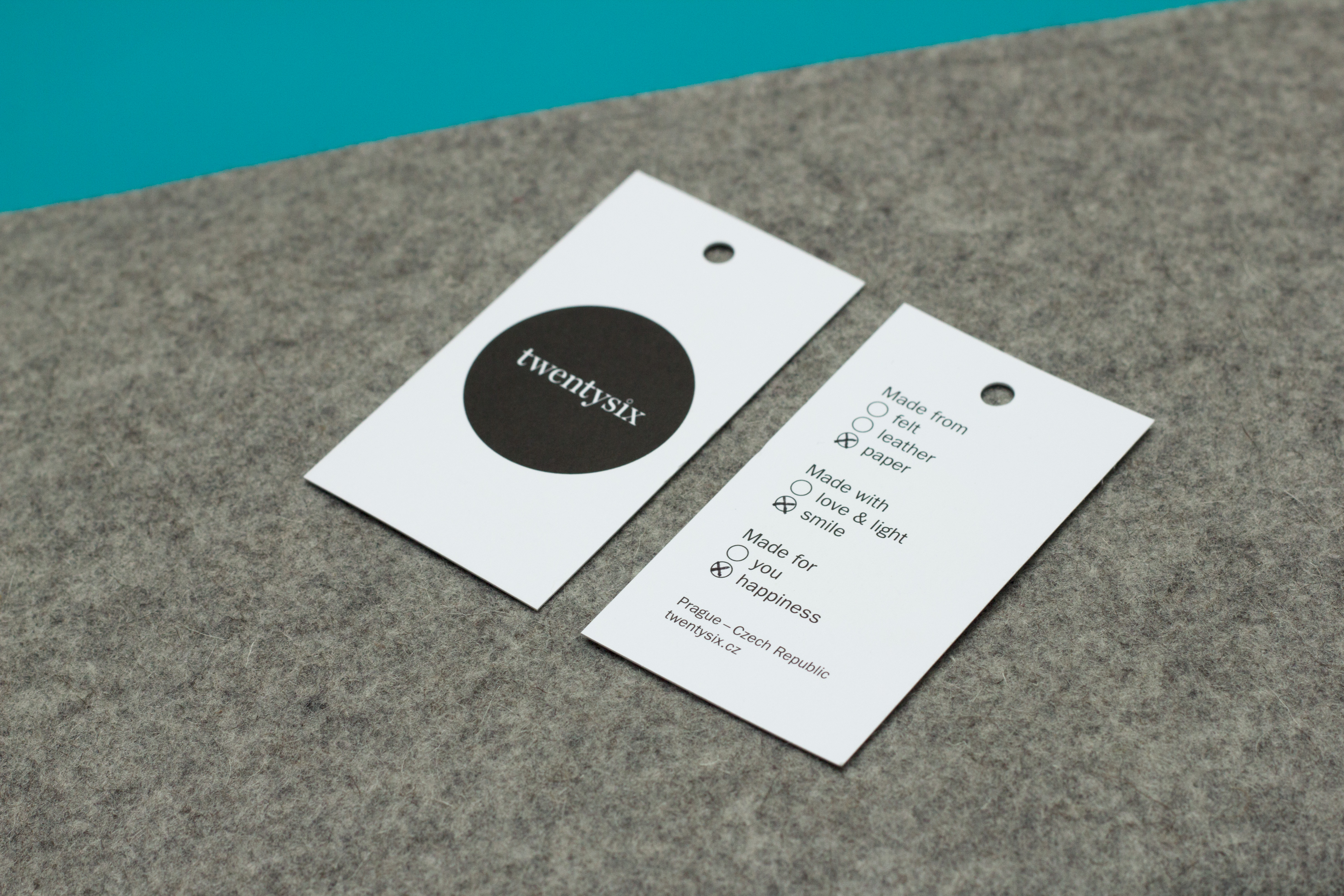
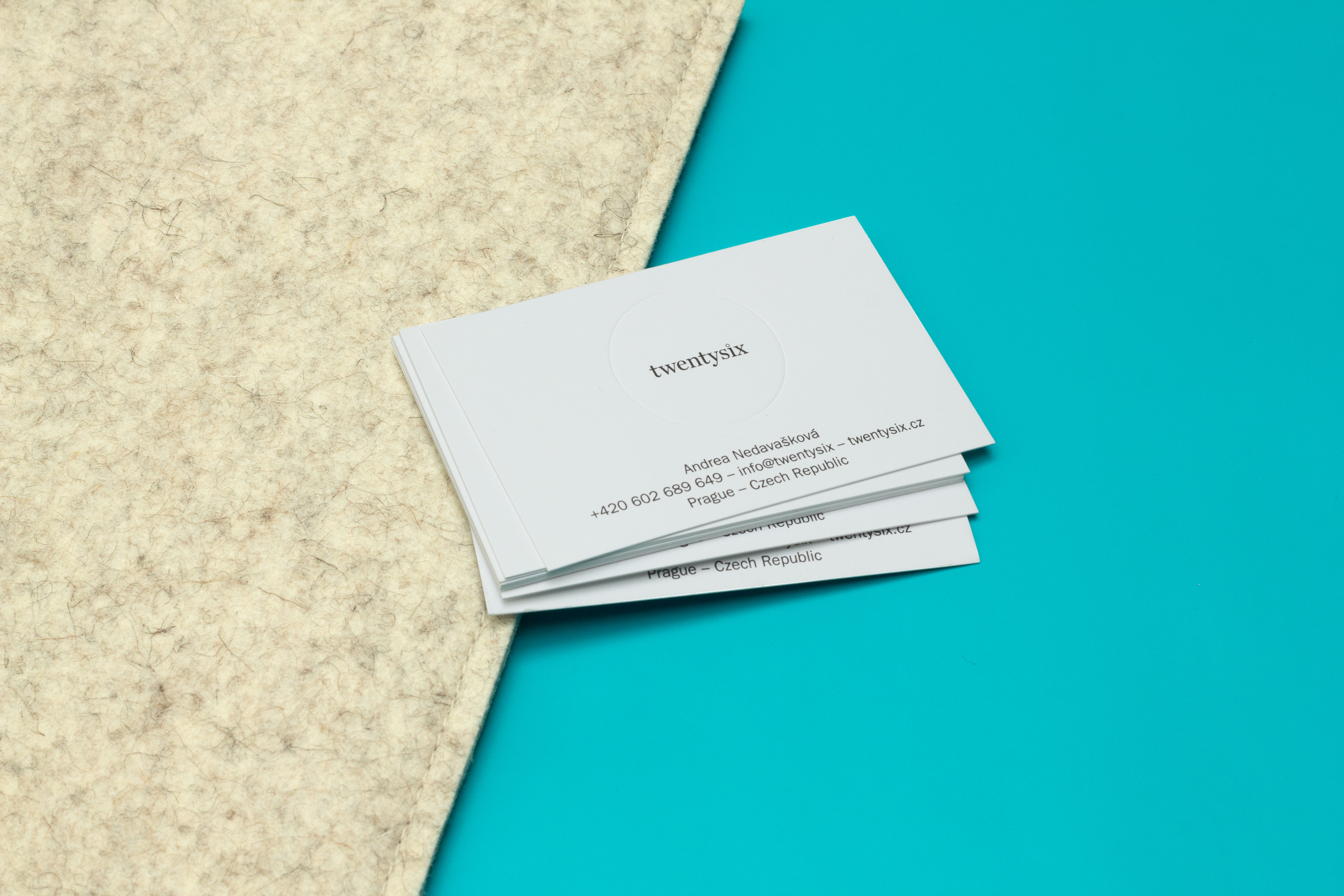
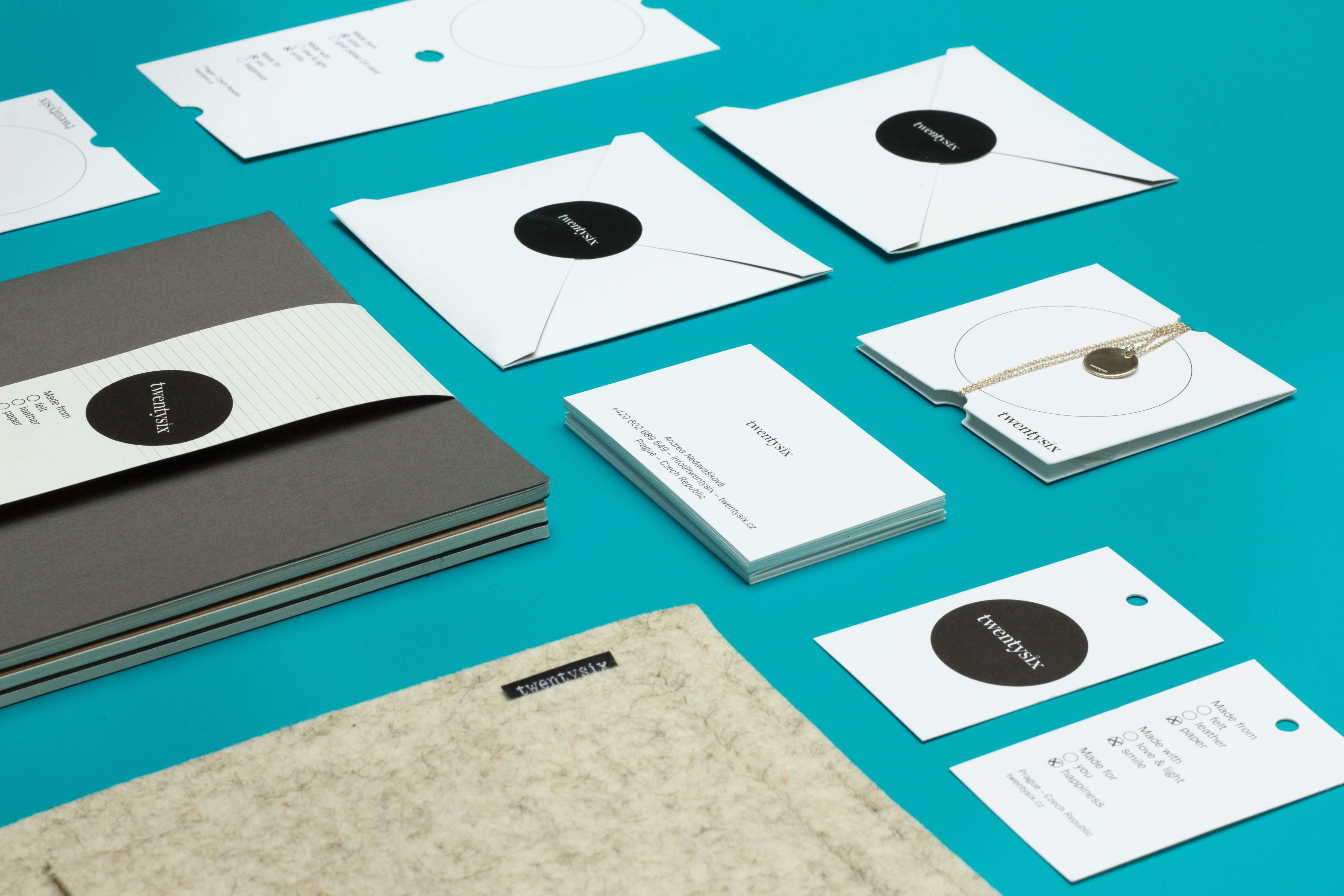
We redesigned the brand’s logo, created a new visual style, and designed an entire packaging system for Twentysix products. Geometric shapes correspond with a black-and-white colour scale and the silky paper used forTwentysix’s business cards, tags, envelopes and stickers. We also developed a custom-made set of hand-sewn notebooks with different lineatures.
Realized 2015


